Count on Anthropologie to come out with a store credit / gift card made of THICK YUMMY PAPER, that has a gray layer sandwiched in between!
Showing posts with label branding. Show all posts
Showing posts with label branding. Show all posts


Birthday Greetings
It was my birthday on the 17th and I was pleasantly surprised by this thing I got in the mail from Anthropologie. I think it's a great thing they started. Sure, a lot of retailers give out special deals on your birthday, but seldom is it delivered in a way that really makes you smile. This is strike 2 for Anthropologie. Here's the first.
Take note of the consistent execution of the concept: From the constellation on the envelope to the screen print on the fabric, and most especially to that clever star that became a button to hold the flap down!


Take note of the consistent execution of the concept: From the constellation on the envelope to the screen print on the fabric, and most especially to that clever star that became a button to hold the flap down!


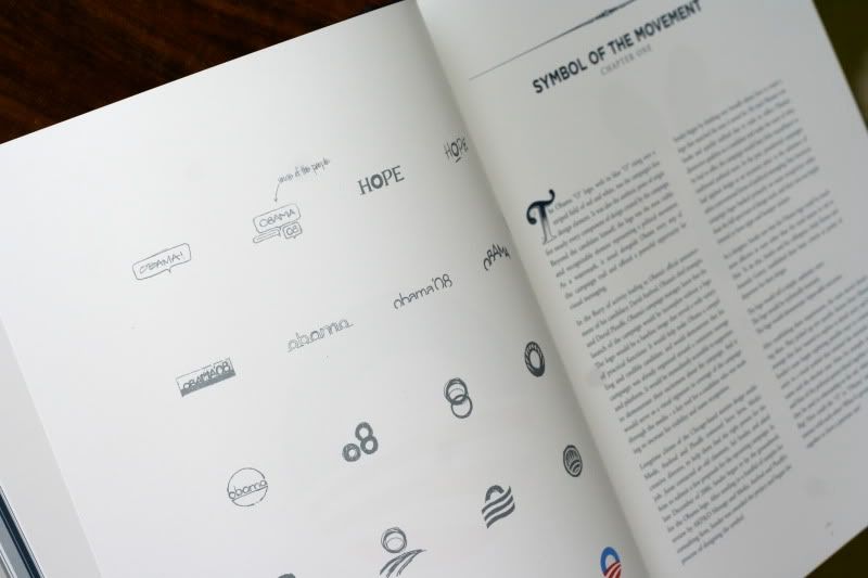
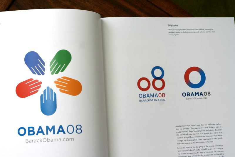
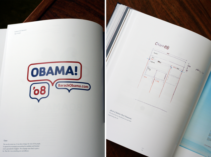
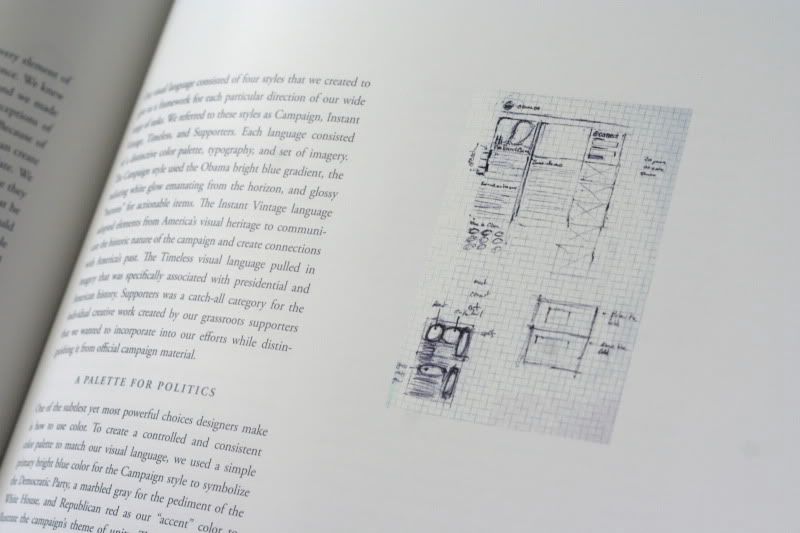
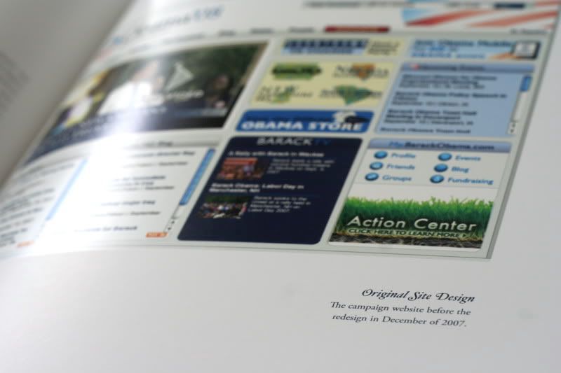
Designing Obama
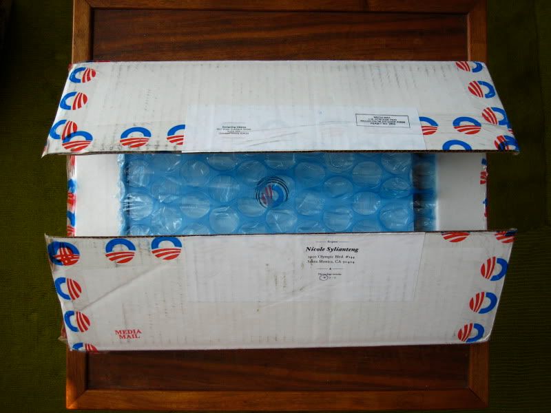
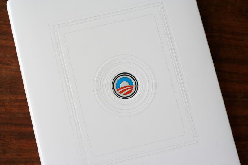
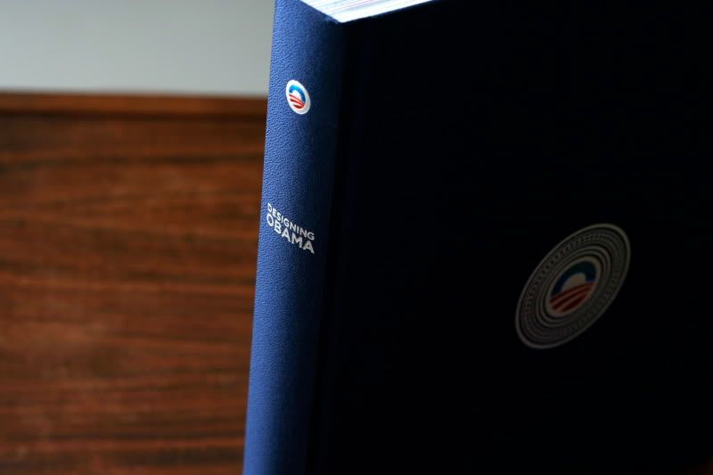
Here's a peek into the book I backed on Kickstarter. Finally got it in the mail. It's always interesting to see the not-so-polished process behind all the slick perfection.


Best Retail Birthday Card Ever
I got this in the mail from Anthropologie... No store has ever made me feel more special.


Clothing labels
When I first came to the states, this is the main reason why I wanted to work for Anthropologie.
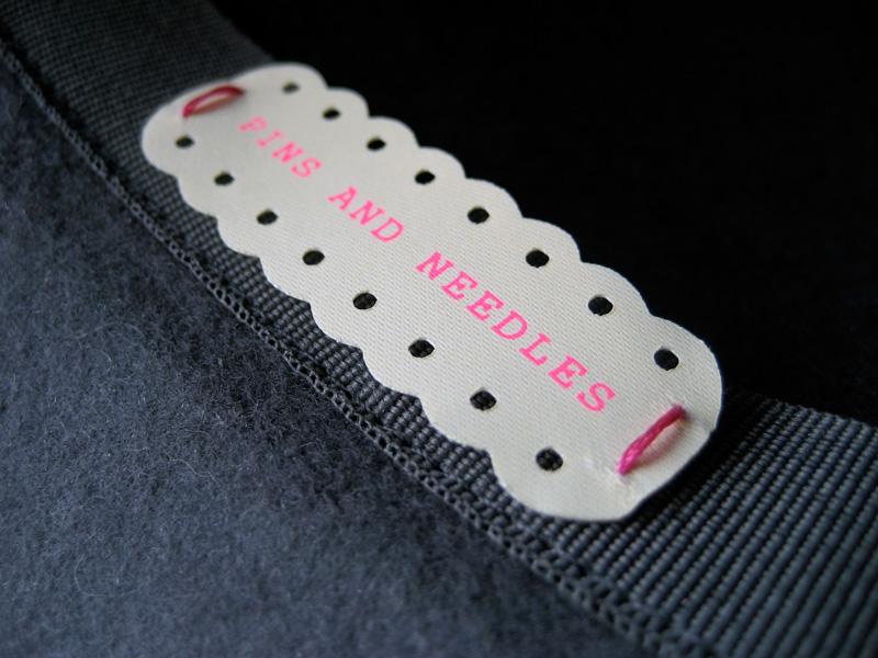

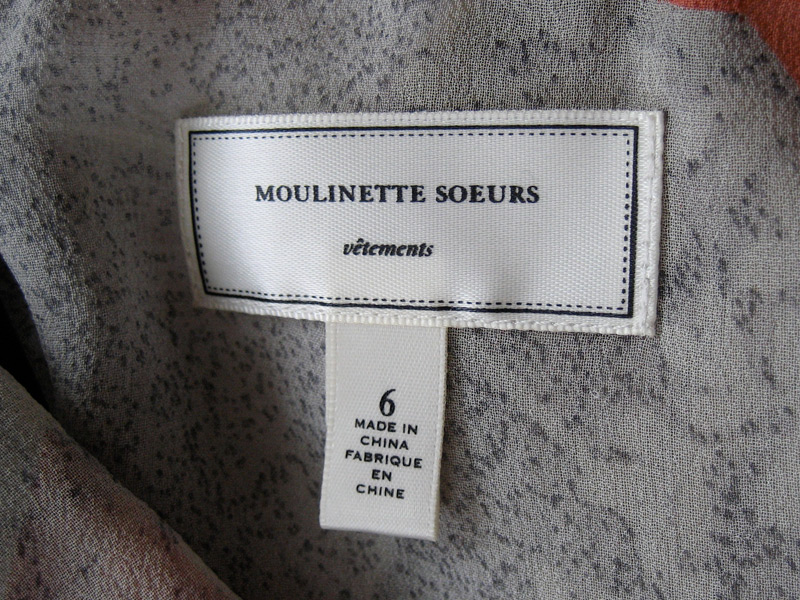
Dan of grayhood is a senior graphic designer at urban outfitters, inc. and does all these cool little clothing labels.
Dan of grayhood is a senior graphic designer at urban outfitters, inc. and does all these cool little clothing labels.
Logo Design: NYT Wine Club

The simplicity, subtlety, and succinctness of this logo really caught my eye.
La Charcuterie

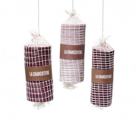
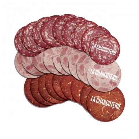
Look at how perfect this is for a preserved meat shop!!! Why didn't I think of this! Business cards are salami, and displayed in netting just like real cured meat, and their stationery is made of butcher paper. WIth salami stickers.
Oh. La Charcuterie is a deli in Vancouver that serves sandwiches filled with deli meats. Rethink are the designers.
Transit Authority Figures
I read a post this morning on Apartment Therapy about "Grown-Up Posters" and clicked on the one of a transit map, since I'm always on the lookout for good ones. This led me to designers Rob & Damia's website, whose colors I really like. But really, the point of this post was for me to commend them on their logo, which I think is really sharp and... I want to say, iconic.

Consistency

via thinkingalaud
UPDATE: Javi pointed me to this little rebuttal of an article. Okay okay. But I still think the original is valid. If you try to group the similar logo styles together and count them as one, Pepsi still has more changes. 4-5 versus Coke's 2. Was the 1985 "Coke" really a replacement for the full Coca Cola name/logo? I still think Coke wins.

Subscribe to:
Posts (Atom)