Count on Anthropologie to come out with a store credit / gift card made of THICK YUMMY PAPER, that has a gray layer sandwiched in between!
Showing posts with label graphic design. Show all posts
Showing posts with label graphic design. Show all posts


Birthday Greetings
It was my birthday on the 17th and I was pleasantly surprised by this thing I got in the mail from Anthropologie. I think it's a great thing they started. Sure, a lot of retailers give out special deals on your birthday, but seldom is it delivered in a way that really makes you smile. This is strike 2 for Anthropologie. Here's the first.
Take note of the consistent execution of the concept: From the constellation on the envelope to the screen print on the fabric, and most especially to that clever star that became a button to hold the flap down!


Take note of the consistent execution of the concept: From the constellation on the envelope to the screen print on the fabric, and most especially to that clever star that became a button to hold the flap down!


Christoph Niemann Interview
I see a lot of myself in Christoph Niemann's work. I think what I love most is the quirk, the humor, and the very personal nature of his pieces. I wanted to learn more about him and found this video interview. Check out his amazing blog at the NYT, Abstract City.
Thoughtful Wall Stickers
I have a pet peeve. And that is for wall stickers that are merely decorative -- no humor, no 2D/3D interaction, no new point of view. But these ones from Hu2 Design elicited from me an internal chuckle. They are meant to interact with your switch plates, reminding us of where our electricity comes from: hamsters, pinwheels, and coal.


VIA GOOD
PS: I seem to always find Andrew Price's pieces the most interesting out of all the others at GOOD, which can sometimes feel a little too hyped up. Good job, Andrew! :)
VIA GOOD
PS: I seem to always find Andrew Price's pieces the most interesting out of all the others at GOOD, which can sometimes feel a little too hyped up. Good job, Andrew! :)
Tea Towel CV


VIA NOT FOR PRINT
I love the audacity of this undertaking, and the fact that it's a CV -- a tea towel created by Hannah Dollery, a graphic designer from New Zealand, who wanted to stand out in the CV crowd.
As part of a recent job I had to go through hoards of CVs to choose people to come in for an interview. I found many of them didn't catch my eye and, in a creative environment, this wasn't really ideal. I wanted to create something that people wanted to keep, surprised them when they viewed it, and made them interested to contact me.
I had never silk screened anything, but I had done some letterpress printing. I had read a couple of articles on the process, but it was all pretty new to me. A friend of mine, Amy Pyle, who is a wonderful textile designer, helped me with the printing of the tea towels. We had a couple of problems with the fine lines which I had used to create some of the patterns, and we solved this by being patient while pushing the ink through. It was great to use silk screen and I will definitely be using it again.
As it was a small production run, if I were to do it again, I would do about 50 more!
Candygrams
Candygrams are a series of odes to candy by guest authors during the month of October on designer/developer Jason Santa Maria's blog. The most recent installment is by Jessi Arrington of WORKSHOP, entitled "Love Sick" for which she built the title out of a rainbow gradient (her favorite color is rainbow) of actual candy!
I'm not a candy person, but this looks like so much fun to figure out and make! Read about her "process" here.

I'm not a candy person, but this looks like so much fun to figure out and make! Read about her "process" here.
Coming in 2011: New Light Bulb Labeling
Starting 2011, the FTC will require new light bulb labeling, like they have for food. It will contain measures of brightness, yearly cost, life, appearance, energy used, and mercury content. I'm so glad because this will cut down the time I spend in the light bulb aisle trying to make sense of all the confusing information. VIA GOOD, POINT #7

Grant Certificate by Thesis
Here's an interesting approach to a Grant Certificate design by studio Thesis that was featured on FPO. They based it on a poster announcement for the grant, which was basically a photo of a stack of blank sheets of paper with post-it notes and flags sticking out from between the pages. The details of the grant application were scribbled on these scraps of paper. I'm really drawn to designs that are derivatives of an original form. It's like math and its underlying laws. I like the simplicity of it all.


Designing a better subway map
Here's an interesting idsgn article on the fine line between aesthetics and usability. At the end of the day, which way do you choose to sway?

Revisitng Letterpress
Picks from a virtual revisit to letterpress studio, Studio on Fire.
 I'm so used to looking at minimal letterpress designs that these over-saturated/colored ones jumped out at me.
 Curious metal clips I've never seen before...
 The only word I have to describe this is YUMMY.


Boats
I don't have any special feelings for boats but I do like this poster by Maddison Graphic. The simplicity of line, the water wave used as a footer ruler, the thoughtfulness and consistency of color use in the poster and on the packaging... makes this feel very put together and well-considered.


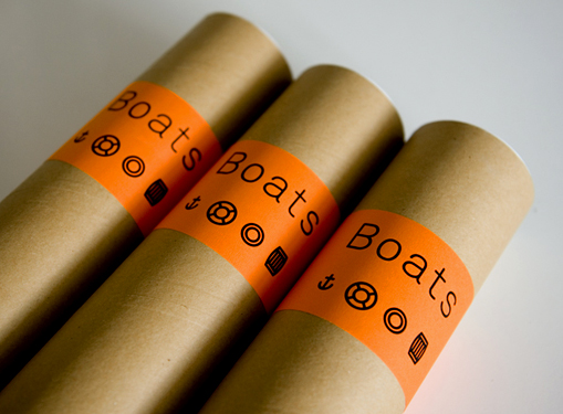
If you're willing to shell out more than a little cash, it can be purchased at Maddison Graphic for £25 + shipping.
IMAGES FROM MADDISON GRAPHIC AND FOR PRINT ONLY
If you're willing to shell out more than a little cash, it can be purchased at Maddison Graphic for £25 + shipping.
IMAGES FROM MADDISON GRAPHIC AND FOR PRINT ONLY
A Rare Sampling
Remember the Five Spices seasoning I sprinkled on the Spring Onion Pancakes in this post? Well I decided to share it with a friend who is both a foodie and Taiwanese. I love sending friends little surprises and this was a perfect excuse.

 I put a wooden type O, that I got from a friend, to good use. Olivia is my friend's daughter's name.
 The sun comes from the Taiwanese flag.


 I put a wooden type O, that I got from a friend, to good use. Olivia is my friend's daughter's name.
 The sun comes from the Taiwanese flag.

Paper Bags + Word Games


Two of my favorite things! Cleverly used in this party setting, by Twig & Thistle, discovered through Mint.
Designing Obama
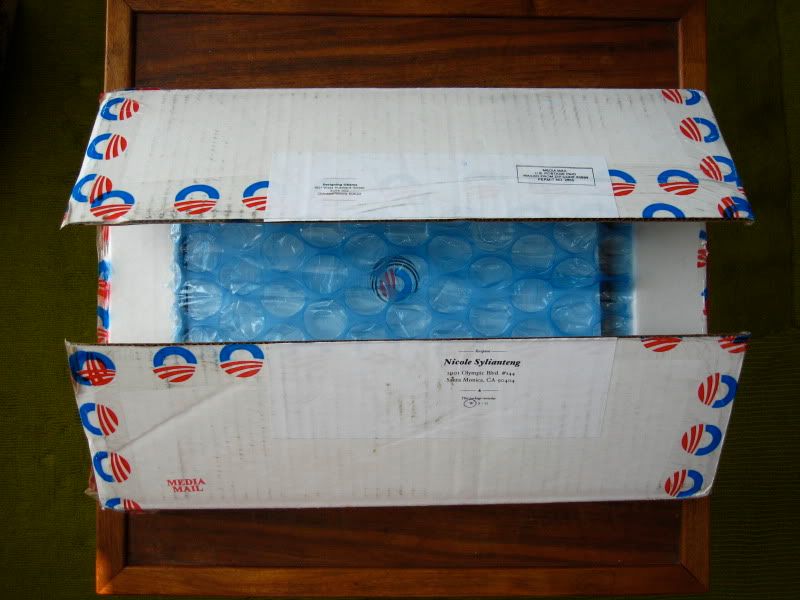
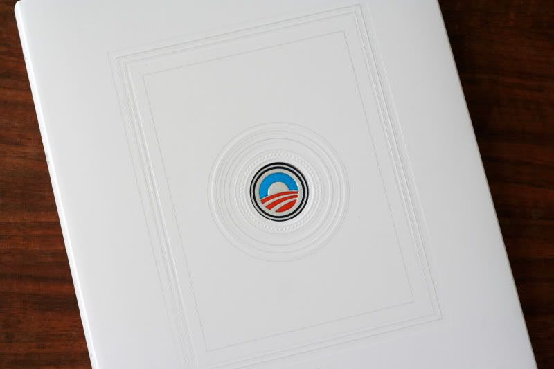
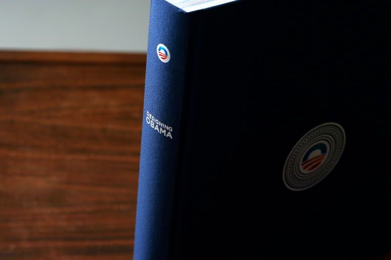
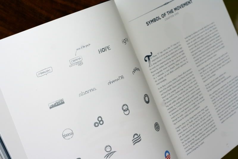
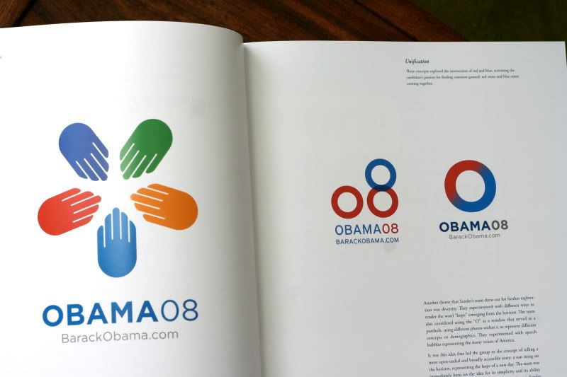
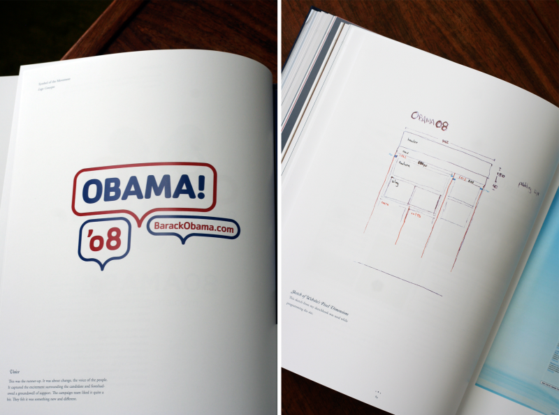
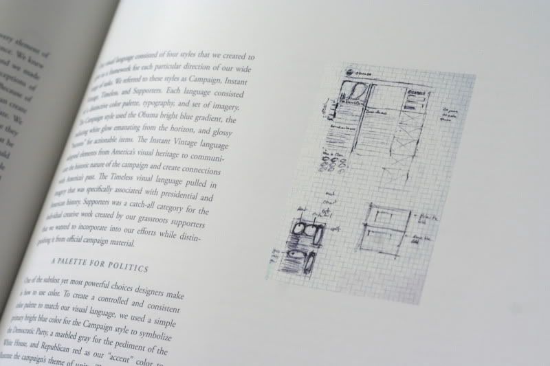
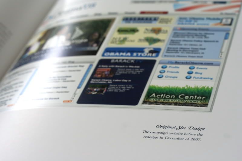
Here's a peek into the book I backed on Kickstarter. Finally got it in the mail. It's always interesting to see the not-so-polished process behind all the slick perfection.


Dwell Patterns
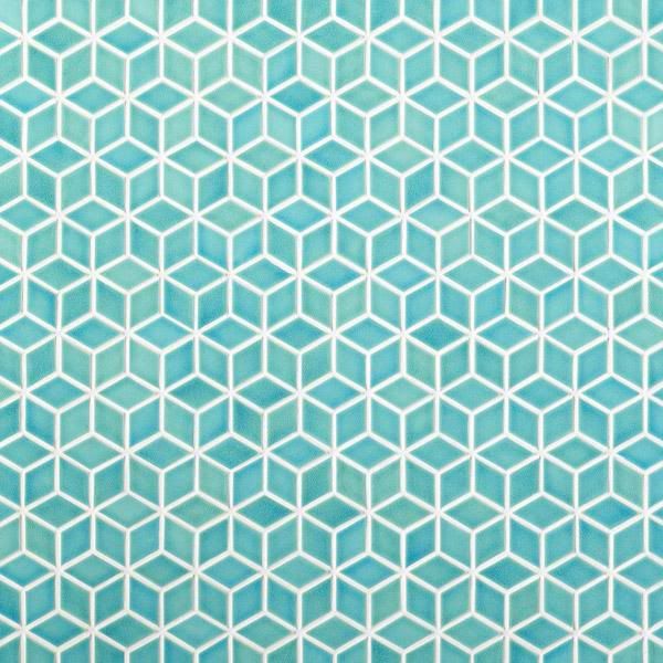
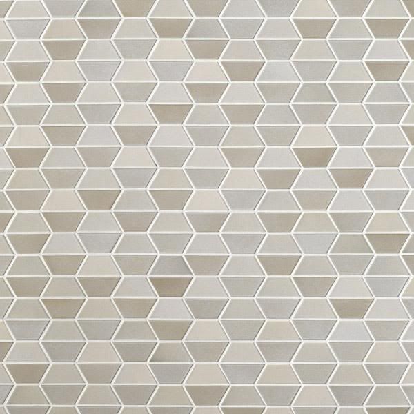
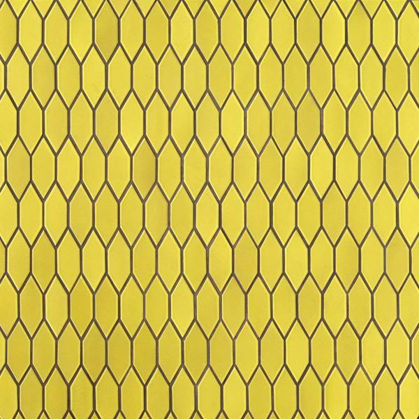
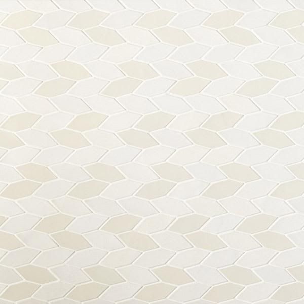
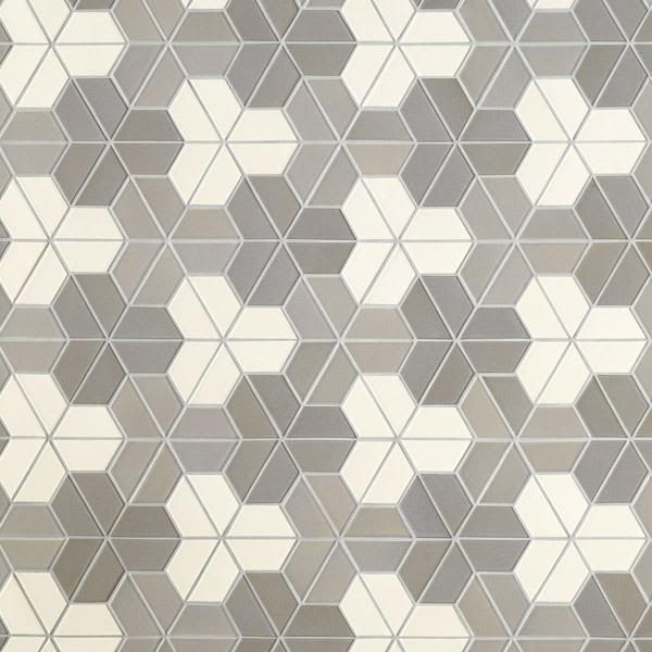
Heath Ceramics teamed up with Dwell to create these amazing tile (or whatever you want it to be) patterns. I'm not really a pattern person, but there's something really inventive about these...


Jessica de Jesus: The Energy Debates
While posting my stuff on the portfolio website Behance, I came across this girl's amazing portoflio. Her name is Jessica de Jesus and what caught my eye was the GOOD magazine cover she helped with during her internship there.
Browsing through her other work, I came across one called The Energy Debates, which I thought was really genius, really thoughtful and innovative.
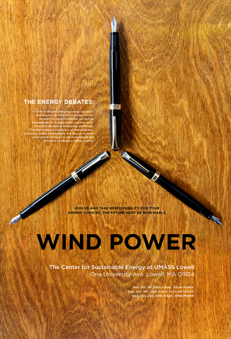
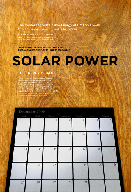
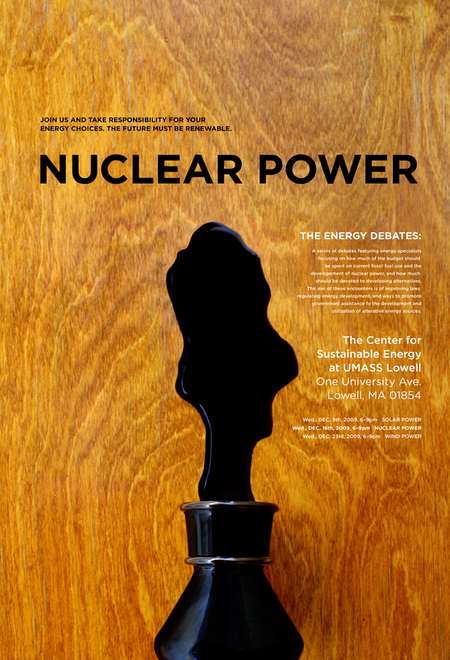
Browsing through her other work, I came across one called The Energy Debates, which I thought was really genius, really thoughtful and innovative.


WEP Posters
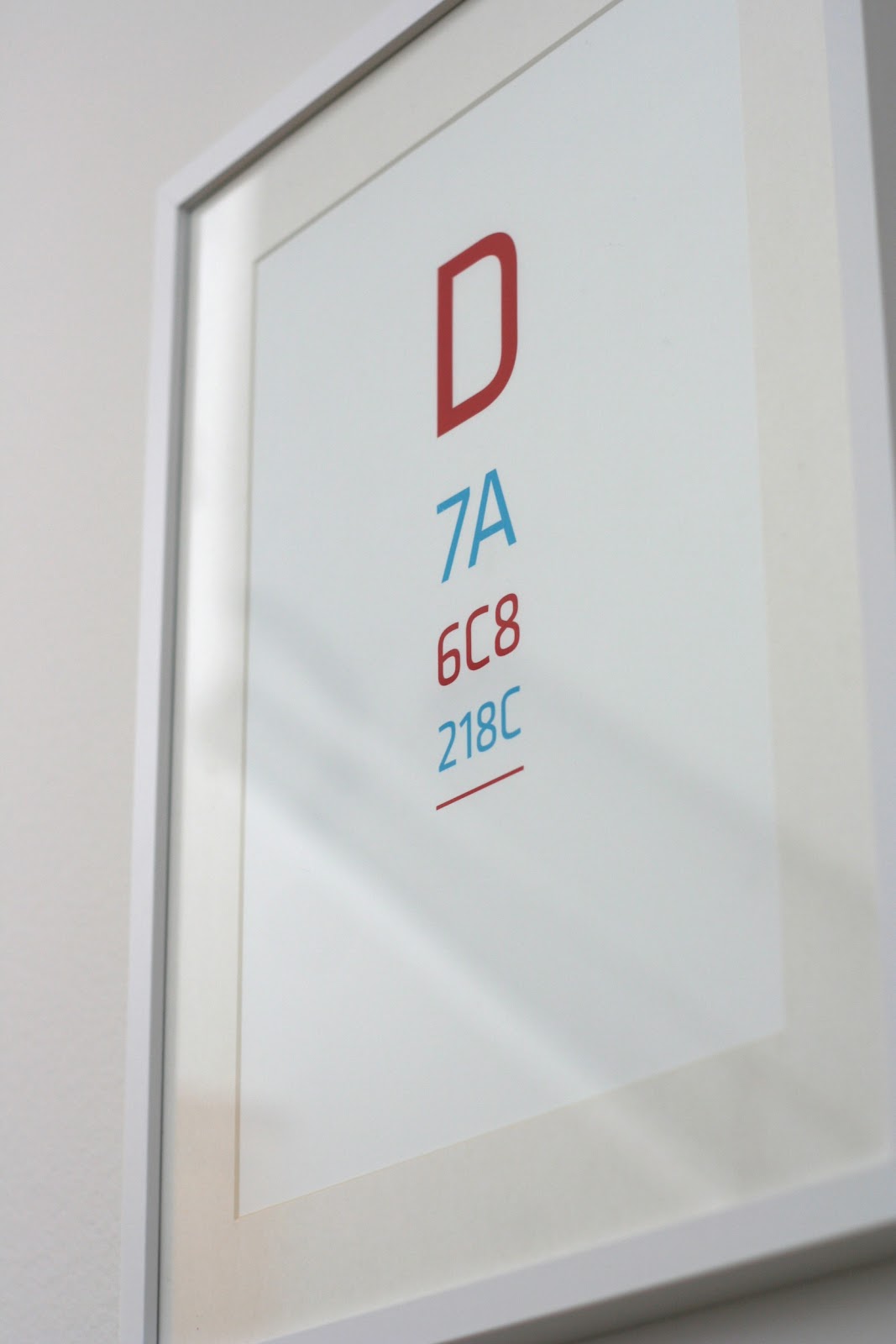
I made this poster in response to my dad's never-ending question of "what's our wep code (translation: wireless internet password) again?" It needed to be in the open and obvious to those who need it and are authorized to have it, but invisible to the rest. Coincidentally, it brings together a lot of my interests: graphic design, technology, communication, information, easter eggs, and other sleuthy things.
Want to secretly celebrate your forgetfulness? Email me!
$36.50 framed.
$20 unframed.
We can work on a custom design together as well!
Rule for black & white version: Biggest to smallest.


No rule for red & blue version. Pretty straightforward.
Want to secretly celebrate your forgetfulness? Email me!
$36.50 framed.
$20 unframed.
We can work on a custom design together as well!
- - - - -
Rule for black & white version: Biggest to smallest.
No rule for red & blue version. Pretty straightforward.
Subscribe to:
Posts (Atom)